San Francisco
Picnic Reservation
Project Overview
San Francisco Recreation & Parks offers many recreational activities and spaces for the public to enjoy in San Francisco. Over the course of 4 weeks, I redesigned and enhanced the user flow of booking a picnic rental reservation to facilitate higher completion rates.
The Problem
Target User
Resident of San Francisco
Adult (>21 and <65)
No relevant disabilities
No car — needs to use public transportation
Reads and writes English
Primarily uses phone
My Solution
Client
San Francisco Recreation & Parks
Role
Solo UI/UX Designer
Timeline
4 weeks (September - October 2023)
Tools
Figma, Figjam, Google Docs, iPad
How might we redesign a picnic reservation flow to increase the reservation completion rate for users?
Booking a picnic reservation through SF Rec & Parks’s current flow is not user friendly and is difficult to navigate. I was given several constraints and details as project guidelines:
I conducted an initial usability test and user interview with three users to evaluate how intuitive and user-friendly the current reservation flow. The interviews were conducted on Zoom in order for me to see their screen and track their interaction flow. I asked the test users about specific features of the current flow that they liked or thought needed improvement. From my research, I identified three common pain points:
Confusing CTA button
Figma Prototype: Try the final design here!
My Design Process
Business Goals
Filter Popup
Design Decision Explanation
Filter popup allows users to edit previous information and choose amenities to find their most desired site.
Crazy 8’s & Sketches
What’s next?
More users successfully complete the flow (% completion)
Fewer cancellations or problems
Website Audit
Comparative Analysis
I went through Airbnb’s flow and noted its succinct and detailed information as well as overall aesthetics. I was especially inspired by its filter and login/signup placement in the flow. This comparative analysis helped me ideate possible features to facilitate a seamless reservation process.
Initial Usability Testing
The main insights from comparative analysis:
filters and other user inputted information must be editable in case they change their mind.
it makes more sense to allow users to log in/sign up after seeing the base booking price instead of making them go through an additional flow.
I created a persona that humanizes and aligns with the project context and user goals.
Low-fidelity Wireframe
Ideation
The Importance of Order
Reflections
This was my first redesign project that allowed me to go through the entire design process and I found that I enjoyed it very much! Here are the main takeaways I got after completing this project:
User Need is Key
User Goals
Wants to have a picnic for their birthday (weekend in late October)
Picnic table, nice location
Can have alcohol
Near a bathroom
With the chance to expand on the design, I would conduct final usability tests to understand whether my design has successfully addressed common pain points. Other than private picnic reservations, I would also love to simplify the reservation flow for both commercial use and/or larger groups.
Persona
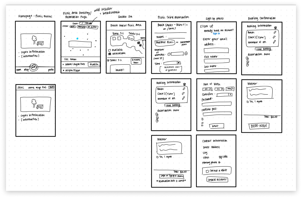
I performed a Crazy 8’s exercise and decided to focus on a picnic table selection screen (which I removed later but still used a similar idea for selecting a picnic site). Branching off from these ideas, I roughly sketched a wireframe for the reservation process.
Information hierarchy should be taken into consideration when designing — think about what users first see when they open the design. If a user chooses a picnic site where coyotes were spotted but the coyote warning wasn’t immediately noticeable, their safety might be at risk and their trust in the website would suffer.
Every design decision should be based on whether it would satisfy general user goals and address user pain points. The better the product accommodates users, the higher its overall quality.
After the website audit, comparative analysis, initial usability tests/user interviews, and ideations, I created a low-fidelity wireframe that mapped out my idea of visuals, interaction flow, and screens.
I assessed the overall user experience of the Picnic Reservation site and took notes on what worked and what did not work as well. This website audit supported an iterative design process.
Filters were difficult to use and deemed unnecessary
Single CTA Button
Combined the “Picnic Area Directory” and the “Picnic Area Map” button into a singular sticky CTA button “Find Picnic” — eliminating difficulty in beginning the reservation flow.
Selected Site Page
Improved the information hierarchy, added included amenities, and base booking price before required sign in/sign up screen.
Takes too many clicks to complete an action
Combined Views
“Picnic Area Directory” consists of both a map and list view for convenience.


